The Mad Angler's Manifesto by Michael Delp
|

|

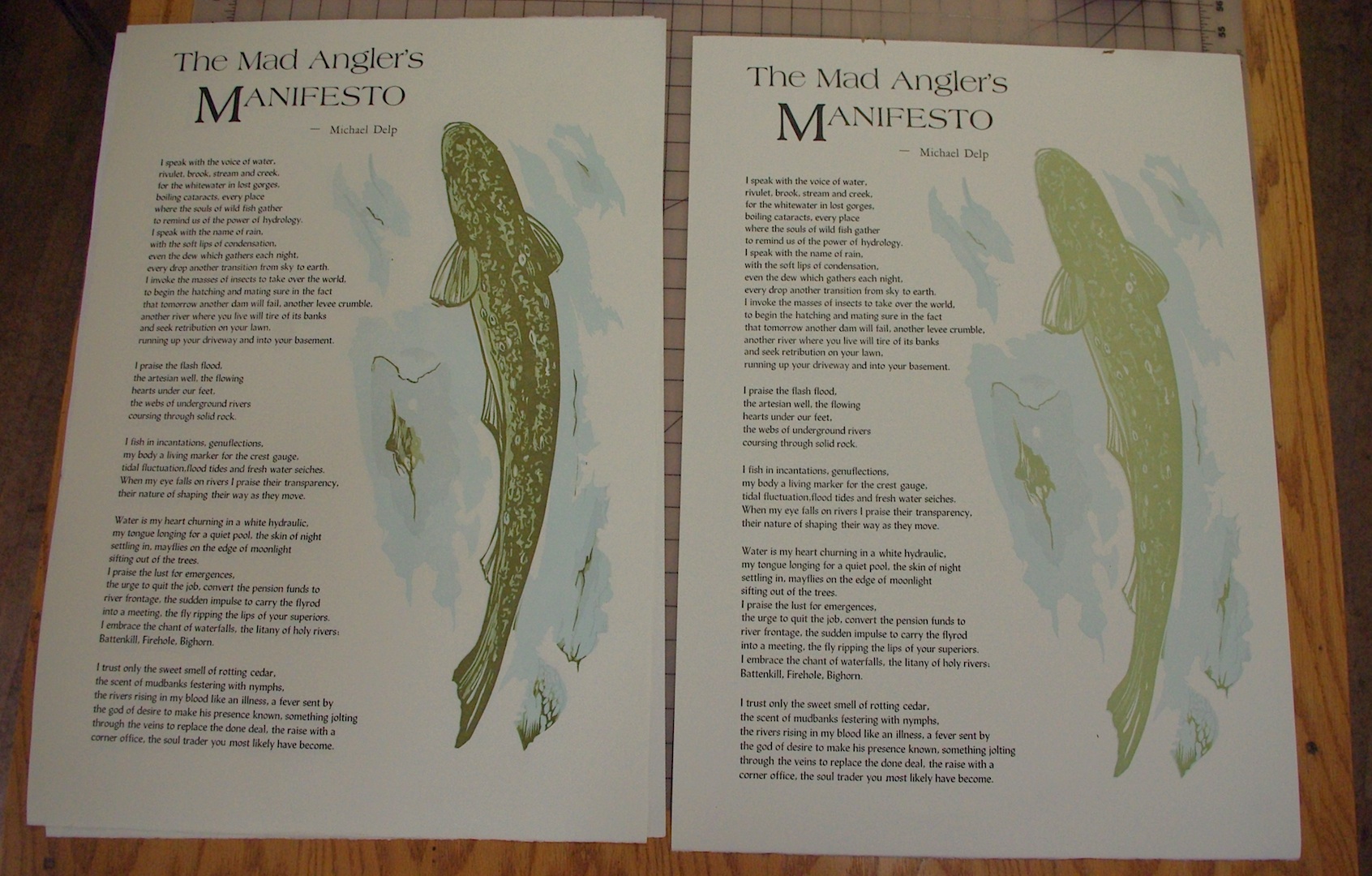
The numbered edition
|

The lettered edition
|
I first heard rumors of Michael Delp's series of Mad Angler
poems a couple years ago and was intrigued. Once I coerced him to send
me some of them I knew I had something here with the Manifesto poem. In
some of my past events at Interlochen I've had the pleasure of hearing
him speak and recite his work as well and was always entertained
- further charmed with the stories of the Mad Angler on the stream. So
here is our combined effort for your viewing pleasure, I sincerely hope
it finds its way to your fishing shack wall.
Michael Delp
is a writer of poetry, fiction, and nonfiction whose works have
appeared in numerous national publications. He is the author of Over
the Graves of Horses (Wayne State University Press, 1989), Under the
Influence of Water (Wayne State University Press, 1992), The Coast of
Nowhere (Wayne State University Press, 1997), and The Last Good Water
(Wayne State University Press, 2003), in addition to six chapbooks of
poetry. He taught creative writing at the Interlochen Arts Academy and
received several awards during his time teaching there.

~
Composed in 24pt Lydian with
Americana display type in 144pt with an 8 line Americana piece of wood
type for the drop cap. Seven color linoleum reduction print by Chad
Pastotnik and printed on Somerset Book 175gsm cotton paper in an
edition of 50 on a Vandercook 219 OS. 18 5/8 x 26 inches (47 x 66 cm),
signed and numbered by the author and artist. $235
The secondary edition is of the poem printed on some white domestic
commercial stock with a rough finish I’ve had left over for years now
and features the result of the final linoleum block state. What is the
black in the previous edition is now a dab of raw sienna mixed with
heavy plate oil to create an underprinted image of the trout with the
poem. Edition of 36, 12 3/4 x 26 inches (32 x 66 cm), signed and
lettered by the author and artist. printed in 2 colors and are
available for $65.
signing the edition
|
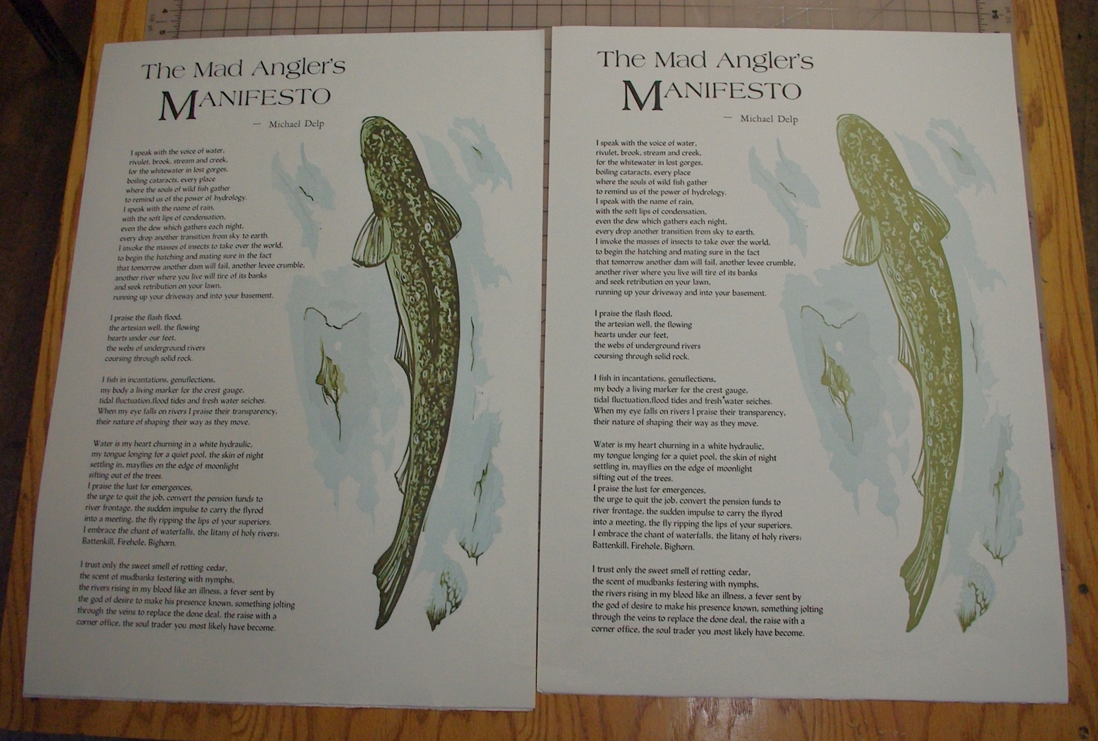
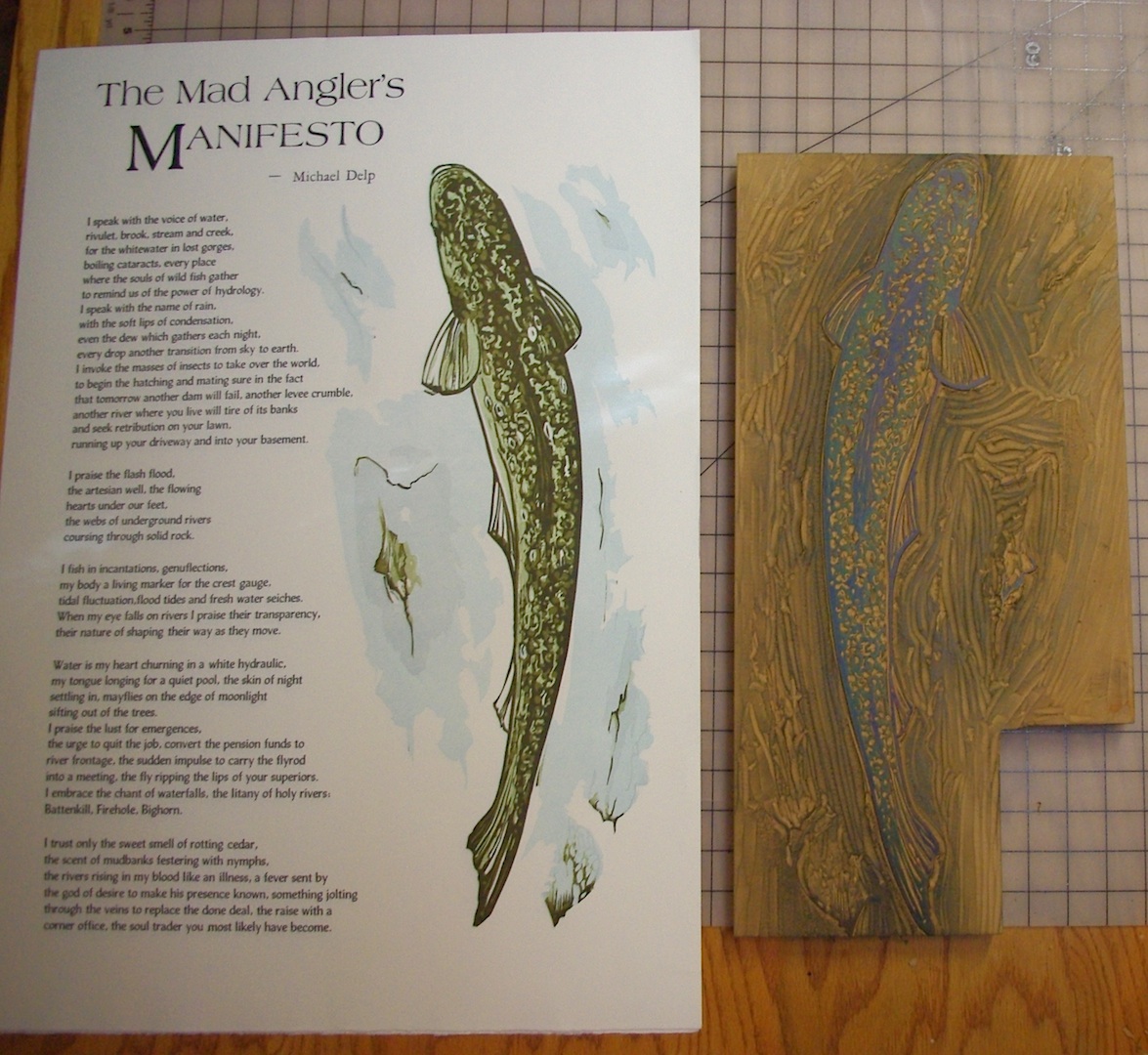
A relief printing color reduction print (suicide print) is
started with the lightest color and only removing the whites, the
negative space around the overall image. Then progressively removing
more of the linoleum to create the next layer of color. Looking at it
close, in visual reading range (about 5-6') and from across the room as
a compositional complement to what is going on with the text -
different things happen with the trout at various distances, something
your computer just can’t translate…
The nature of reduction printing precludes any future editions. The
block is systematically destroyed in the creation of the finished print.
From the beginning I planned to add a bit of red/sienna in the fins to
the image and so left those areas open with the white to hit with some
water color at the very end. If those areas had remained to print the
sienna at the end it would have to have been over the black and that
would have meant a very opaque ink, probably two press runs of a silver
and then the sienna over it but I wanted it to remain washed out and
transparent. I also wanted the salvaged block of the last run to be
used for an under print on the lettered edition.
More information about the casting of the type and initial layouts and design can be viewed on my blog.
Below you can see the evolution of the linoleum block and the print as progress was made:
|
|